The Astros and Blue Jays began this month with a four game series in Houston that produced a total of just 15 runs for the two teams, but a bumper crop of 105 strikeouts. The latter figure and Toronto’s share (61 whiffs) are both reported to be records for a four game series. Despite all the swings and misses, Toronto took the set 3 games to 1, outscoring Houston 10-5, with seven of those ten runs coming off solo home runs.
That series is an extreme example but an instructive one on the growing trend in baseball of games dominated by home runs and strikeouts, two of the “three true outcomes” or TTOs (the third is walks), so named because the defense can do nothing to affect the results of those events.
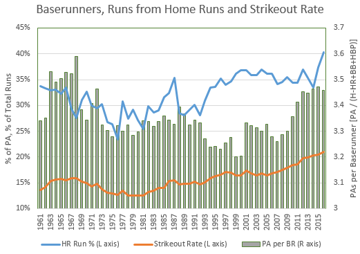
The dominance of home runs and strikeouts is illustrated in the chart below showing trends since 1961.
The two lines are strikeouts (orange) and runs from home runs (blue), both plotted against the left axis. Striekouts were below 15% of PAs as recently as 1992 but are now above 20% and increasing at a roughly constant rate since 2005. That’s one third more strikeouts than just 25 seasons ago, and no sign that the trend is abating.
More strikeouts means fewer balls in play and fewer baserunners, thus placing greater reliance on the home run for scoring runs. The percentage of runs that scored via the home run was below 30% as recently as 1992 but has now crept above 40% for the first time, again a one-third increase in just 25 years (Note: these data are shown only since 1961 because I relied on the Batting Event database from Baseball-Reference.com to calculate the percentage of runs scored via home runs; those data show the baserunner state for every home run hit back to 1974 and almost every one back to 1959, with only the 1968 season having missing home runs amounting to more than one half of one percent, with 0.6% missing in that season).
The fewer baserunners resulting from more homers and strikeouts is illustrated by the green bars, indicating the ratio of total PAs to PAs producing baserunners. I’ve calculated this as PA divided by the sum of hits, walks and HBPs less home runs, with the home runs subtracted because they remove baserunners instead of creating them. That metric is showing results not seen since the so-called “second dead ball era” of the mid-1960s, with ratios in recent seasons of more than 3.4 to 1 for total PAs to PAs producing baserunners.
Another illustration of these trends is shown in the chart below.
 The blue bars plotted against the left axis show a steady reduction in plate appearances producing balls in play (which include home runs, in this illustration). At the beginning of the live ball era, balls in play resulted in more than 90% of PAs excluding walks and HBPs, a figure which, outside of the 1970s, has dropped consistently since then. Today, that number has fallen below 77% for the first time and has been dropping at a steeper rate since 2005 than at any previous time.
The two lines on the chart, both plotted against the right axis, show the increasing emphasis on home runs, at new record highs, both as a percentage of balls in play (orange) and as a percentage of hits (green).
I called these trends a vicious circle because they tend to feed off each other, something like:
- With fewer baserunners, more emphasis is placed on home runs for scoring
- Batters trying to hit more home runs strike out more
- With more strikeouts come fewer baserunners
- And, back to 1.
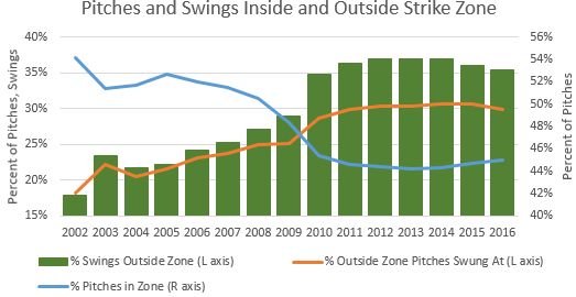
So, what might stop the vicious circle? Time will tell but, on the premise that success breeds imitation, it may help that the last two World Series champs have countered these trends and won by putting the ball in play and keeping pressure on the defense. The other factor may be that there’s been something of an equilibrium reached on the batter vs. pitcher level as shown below.
These data are provided by FanGraphs.com and are derived from PitchFX data, the system that’s been in place since 2002 tracking (among other things) whether pitches are located in the strike zone. Pitchers are no dummies; with batters swinging for the fences, pitchers are keeping more of their pitches out of the strike zone, shown by the blue line. More than half of pitches were located in the strike zone until 2008 but that number has dropped to a fairly constant 45% since 2011.
With fewer pitches in the zone, batters are venturing outside the strike zone to take their cuts. The orange line shows batters swinging at only 20% of pitches outside the zone in 2004 but increasing that proportion to 30% (a 50% increase) by 2011. Similarly, the percentage of swings at pitches outside the strike zone (green bars) was below 25% before 2007 but has been above 35% since 2011.
The equilibrium I alluded to is that all three of these metrics have more or less held constant since 2011, suggesting that a limit may have been reached on how undisciplined hitters will become and, therefore, on how stingy pitchers can afford to be in locating their pitches in the strike zone. If that’s the case, what might tip the balance and start seeing these trends move the other way is defensive shifting. While hitters may be reluctant to depart from their natural swing tendencies, the lure of a third to half of the field being left undefended could become enough of an enticement for batters to cut down on their swings and try to “hit ’em where they ain’t”. Or, at least, one might hope so.


