This is the first in a series of looks at the distribution of position-player WAR on teams in the wild-card era (1995-2013). All team wins mentioned are Pythagorean wins. All figures are pro rated to 162 team games.
There are 564 team-years in the era. This post compares the top 160 teams (28%) in WAR from position-players, split into three tiers:
- Tier 1: 35+ WAR from position players. These 20 teams averaged 38.0 WAR and 96 wins.
- Tier 2: 30 to 34.9 WAR/pos. These 39 teams averaged 31.7 WAR and 91 wins.
- Tier 3: 25 to 29.9 WAR/pos. These 101 teams averaged 27.3 WAR and 88 wins.
These teams are well over the median of about 20 WAR/pos. While this is about position players only, not pitchers; and while these are the top teams in WAR/pos, not in total WAR or wins; still, the vast majority are good teams overall, as you see by their average wins. All Tier 1 teams have at least 88 wins. Tier 2 has just one sub-.500 team, and 78% of Tier 3 are over .500.
Before we go on, an important note on my method:
When I refer to a team’s #1, #2, etc., in WAR value, the top eight slots go to the top eight in plate appearances. Slots #9 and up go to nonpitchers with the most WAR and at least 100 PAs. Thus, slot #9 may have more WAR than #8. Please keep this in mind as you consider the data. My rationale is at the end of the post.
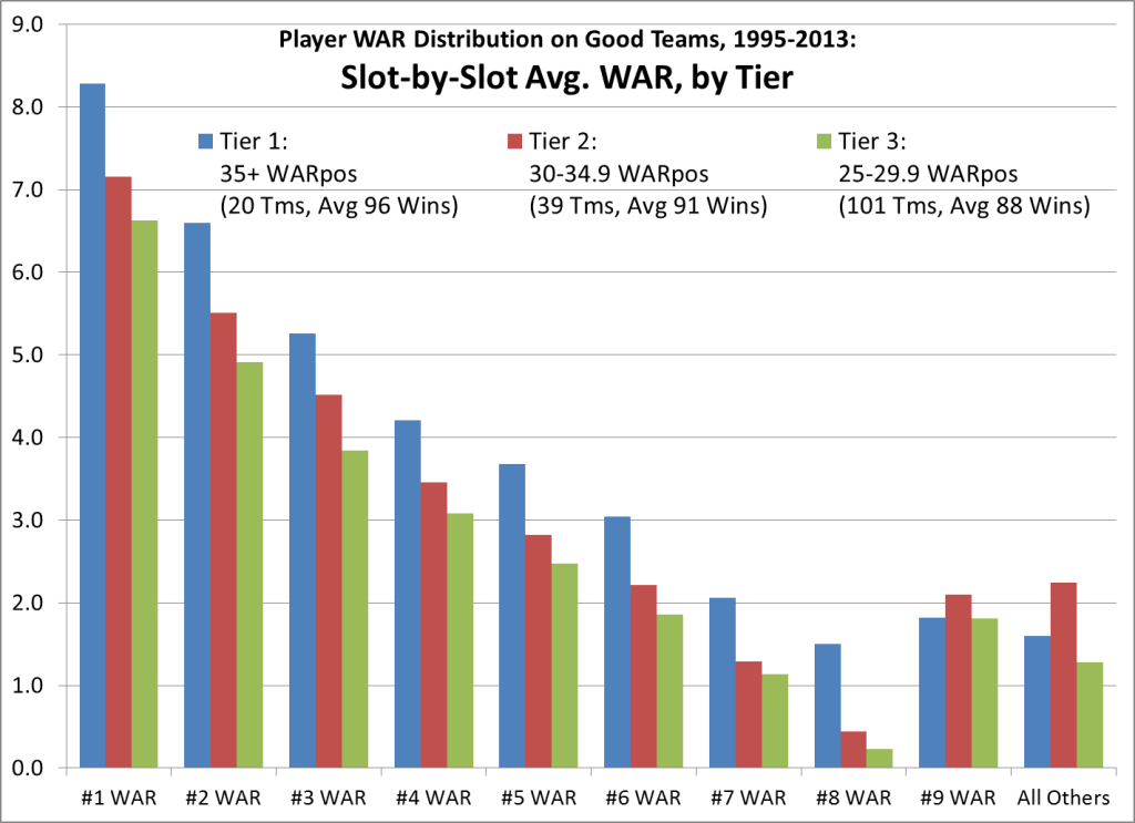
Our first chart compares each tier’s average WAR from each WAR ranking slot, #1 through #9, plus all others combined:
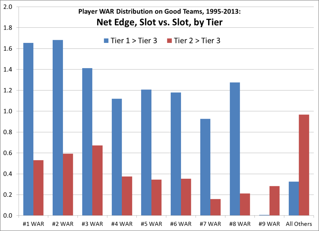
For each tier compared to those below it, slots #1-8 show a fairly steady net edge in WAR. That relationship changes abruptly at #9, and All Others: Tier 1 is actually worse than Tier 2, and barely better than Tier 3. The dynamic is better seen in this next chart, showing the net WAR edge by slot, comparing Tiers 1 and 2 against Tier 3:
On the shift at #9: Remember, in my method, slots #1-8 are reserved for regulars. As the season plays out, most teams see at least one expected regular fall far short of expectations. Those teams that can’t see the problem and solve it — even some good teams — wind up with a hole in slot #8, but a better WAR value (with less playing time) in slot #9. The best teams, due to savvy and/or deeper resources, are better at getting their best performers into the regular slots and getting bad ones out; a solid player who might wind up in slot #9 for a lesser team is more likely to fill slot #8 for a top team.
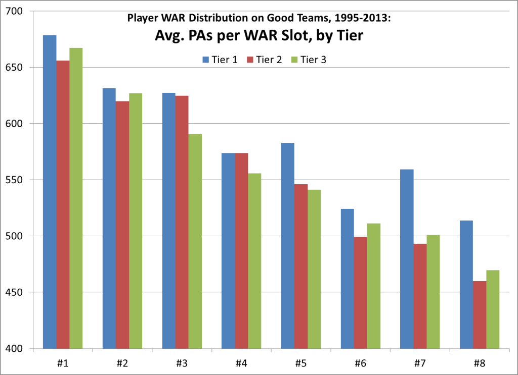
And, more importantly, the best teams are usually the ones with good luck in health. Any team that gets “regular” PAs from all its expected regulars will probably overachieve. In this chart of plate appearances for WAR slots #1-8, note the larger edge for Tier 1 in PAs from the lower WAR slots:
In all, Tier 1 got almost 79% of their team PAs from WAR slots #1-9, while Tiers 2 and 3 each got just over 75%. That difference amounts to about 220 PAs.
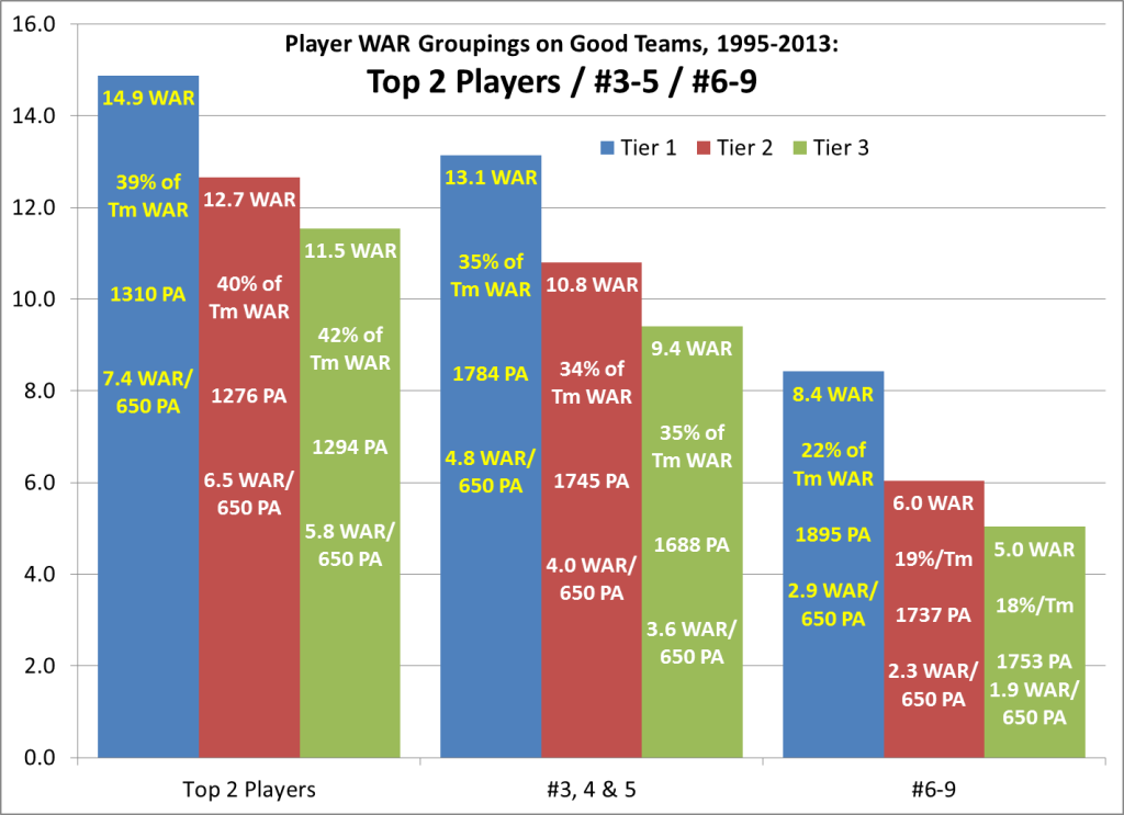
The remaining charts compare WAR in groupings. First, a set of three groups:
- top 2 players combined;
- nos. 3-5 combined; and
- nos. 6-9 combined.
(Feel free to ignore the extra data I typed into the bars.)
Isolating Tier 1’s edge over Tiers 2 and 3:
- Top-2 — 2.2 and 3.4 WAR over Tiers 2 and 3, respectively.
- Nos. 3-5 — 2.7 and 3.7 WAR.
- Nos. 6-10 — 2.4 and 3.4 WAR.
This is the most interesting thing I’ve seen in the data so far: Comparing Tier 1 against each other tier, their edge gained from the lower WAR groups is at least as big as from Top-2 — even though there is less total WAR in the lower groups. One reason is, while even some good teams have a replacement-level regular, the best ones rarely do:
- Just one team in Tier 1 had a negative-WAR regular.
- Tier 2 had 3% of all regulars with negative WAR, but none worse than -1.4.
- Tier 3 had 5% of all regulars with negative WAR, with 5 players at -1.5 or worse.
(Worst in Tier 1 was J.T. Snow of the 2002 Giants, -0.4 WAR. In Tier 2, Skip Schumaker of the 2013 Dodgers, -1.4 WAR. In Tier 3, Brian McRae of the 1999 Mets, -2.2 WAR.)
The Ruth/Gehrig template — two superstars racking up half an elite team’s WAR — is rare in this era. Just 3 of 59 teams in Tiers 1 & 2 got half or more of their WAR from just two players. An aside on those three teams, which are really just two:
- On the 2001 and ’02 Giants, Barry Bonds scored almost 12 WAR each year, teaming with Rich Aurilia and then Jeff Kent to bag 61% and then 53% of team WAR.
- On the 2004 Cardinals, Scott Rolen and Albert Pujols piled up 56%. A third 7-WAR player, Jim Edmonds, brought that trio’s total to 78%, the highest top-3 rate of these 160 teams.
- As fate would have it, both the 2002 Giants and the 2004 Cards lost the World Series to a team with extremely low share of team WAR from its top two — 31% for the 2002 Angels, and 28% for the 2004 BoSox, both in the bottom 5% in top-2 share.
- Those Angels got 4+ WAR from six different players, a feat matched by just two other teams in this era, and rang up the 10th-best team WAR/pos. Boston’s top five players were tightly packed between 3.7 and 4.3 WAR; only one other team ever had five between 3.5-4.5 WAR.
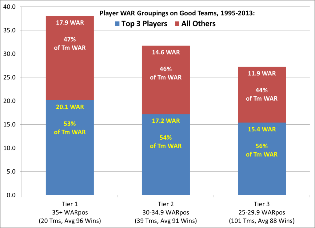
OK, that’s just one arbitrary grouping. This last chart shows another, comparing WAR from the top 3 players and from all others. In this chart, each tier is a separate stack:
Tier 1’s edge over Tiers 2 and 3 in this grouping:
- Top-3 — 2.9 WAR and 4.7 WAR over Tiers 2 and 3, respectively.
- All others — 3.3 WAR and 6.0 WAR.
Once again, in comparing Tier 1 to Tiers 2 and 3, the lower WAR group delivers more of Tier 1’s edge than do the Top-3. This is also true for Tier 2 vs. Tier 3.
Some outliers in top-3 share:
- In Tier 1, the 1996 Mariners led with 65% from their top 3 (Ken Griffey, Alex Rodriguez & Edgar Martinez, total 25.5 WAR). Lowest was 44% for the 2001 Mariners, one of the deepest teams ever. Their 50.9 WAR/pos is so huge that the 5th-highest WAR total by a trio in this era accounts for just 44% of team WAR.
- Tier 2 is led by the aforementioned 2004 Cardinals and 2001 Giants, each with 78%. Lowest was 40% by the 2004 Indians, with a fine and balanced lineup (led AL in OPS+ and WAR/pos), but gruesome pitching (last in ERA+ and WAR/pitch). Next-lowest were the ’04 Red Sox (42%) and this year’s Dodgers (43%).
- Tier 3 is led by the 1997 Astros, 73% of team WAR coming from Craig Biggio, Jeff Bagwell and Bill Spiers(!). Next is 71% by the ’98 Mariners (A-Rod, Junior and Edgar). Lowest is 38% by the division-winning 2006 Padres, who also had the lowest top-2 share in this study; they tolled 28.2 team WAR/pos with a top mark of 4.3, and seven others between 2.4-3.3 WAR.
- Just out of the study, the 1998 Cardinals had 83% of their team WAR/pos (20.6/24.8) wrapped up in Mark McGwire, Brian Jordan and Ray Lankford, with no other player over 1.8 WAR.
Conclusions? The one steady theme I’m getting from all this data is that the gap between elite teams and the merely good ones lies as much in their depth of quality regulars as in their top stars.
This next point is anecdotal and not the focus of the study, but still: None of the 17 teams in this era with two or more 7-WAR players won the World Series; eight missed the playoffs entirely, and the ’97 Astros scraped in at 84-78. Just one of 22 teams with a 9-WAR player won it all (2008 Phils, Chase Utley, 9.0 WAR; no player with more WAR has won since 1976). Just 4% of 7+ WAR seasons, and of 6+ WAR seasons, came for WS champs (6/148 and 11/278).
This one’s more on topic: The last 19 World Series winners averaged about the same WAR/pos as Tier 3 in this study, but they averaged less WAR from their top 3 players (14.6 vs. 15.4), and a lower percentage (54% vs. 56%).
I’m eager to hear your thoughts and interpretations on the above, and suggestions for where else to go with this data. My spreadsheet has all the team WAR/pos and W-L data and relevant position players for 1995-2013. What ratios or relationships would you like to explore? I doubt I’ll look far into the pitching side, if at all; maybe just team ratios of WAR/pos to WAR/pitch. The individual side of that study seems like a quagmire. But don’t hold back your suggestions — maybe you’ll help me see how to navigate the swamp.
__________
Notes
My rationale for ranking all regulars before others who may have more WAR:
I think a team’s regulars are central to any discussion of that team’s value pattern. But if you rank every team’s position players by WAR, you get many rarely-used players ranked ahead of underperforming regulars. Take the extreme case of the 2013 Braves: #7 in team WAR was Ramiro Pena, who played about 1/6th of the time (107 PAs, 212 defensive innings). Seven other Atlanta scrubs had more WAR than the disastrous duo of B.J. Upton and Dan Uggla, who scored -1.8 and -1.3 WAR, respectively — two of the five worst NL regulars.
To me, using a straight WAR ranking — putting quality scrubs in the middle of the frame, while shunting bad regulars to the periphery — only clouds the picture.
And it’s no trivial consideration: Whatever the reasons, teams often stick with a player having a really bad year. There were 160 players in this period who played 100+ games in a season and clocked minus-1.0 WAR or worse — about 0.3 such players per team-year. The risk of a flop year from a counted-on regular is one that few teams can entirely dodge, so I think the negative outcomes belong in the core of this study.
Also note: Because of the structure I’ve chosen, midseason trades or call-ups can cause quirks in the WAR rankings. Mark Teixeira led the 2008 Angels with 3.7 WAR, but he’s designated #9 in this study, because he was just 13th in team PAs, after coming in a deadline deal. Such quirks are regrettable, but I can’t see how to avoid them without micro-managing the rankings.

