We’ve been discussing just how commons shutouts have been in recent years, particularly in 2013 so far. Here’s a little bit of a look at the numbers.
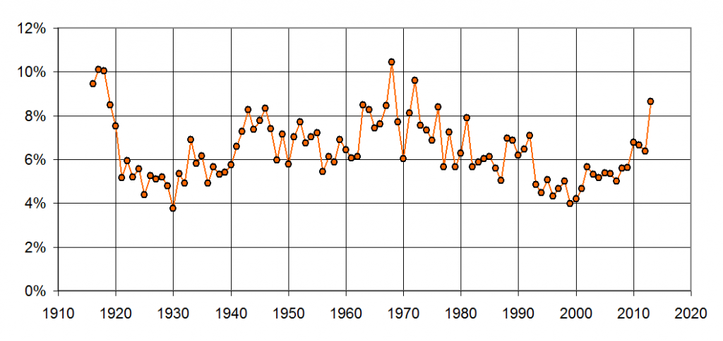
Here’s a plot showing percentage of all games ending as a shutout. I suppose it’s worth mentioning that this plot has a theoretical maximum of 50% since one team wins (virtually) every game. Anyway, note that from 1940 to 1992, the percentage was above 6 most ever year. Then, in 1993, when the steroids kicked in full-force, the rate of shutouts dropped under 6% and stayed there until the resurgence of pitching in 2010. Note that the 2013 is, of course, through Friday’s games and is likely to change before the year is over. If not, 2013’s shutout rate would be the 3rd highest since 1920, topped only by the Year of the Pitcher (1968) and the Year Before the DH (1972).
When I looked at the plot above, I thought it was an awfully high amount of variation. After all, even though run-scoring varies some, I wouldn’t have though the rate of shutouts does as much (or, as it turns out, even more). For example, the rate of shutouts in 1968 is nearly triple the rate in 1930, but run-scoring was only about 60% higher in 1930 than in 1968. So, why were there so many more shutouts?
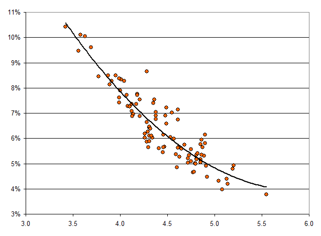
Here’s the answer. The following plot shows percentage of games ending as a shutout as a function of the overall league-wide run-scoring that year.
The solid black line is a simply best-fit polynomial, which I added to show that the relationship between run-scoring and rate of shutouts is definitely not linear. If it were linear, we’d expect seasons with a run-scoring average of 5.0 to have about 3.5% shutouts, but in reality those years are between 4.0 and 4.5%. It makes sense–when run-scoring is high, teams usually push across at least one run. Think about the late 1990s and early 2000s–even when a team was dominated by the opposing pitcher, somebody usually hit a solo home run.
The low-scoring environment is a bit harder to explain if you don’t have a statistics background. The issue here is binning. When run-scoring is as high as 5.0 per game, teams score everywhere from 0 runs all the way up to 9 or 10 runs fairly often–meaning at least a few percent of games each year turn out that way. The result is a smooth histogram of games falling into each bin of 0, 1, 2, 3, 4, 5, 6, 7, 8, 9, or 10 runs, plus a tiny amount of games at 11 or more. However, when run scoring is down in the area of 3.5 per game, the bins are only 0, 1, 2, 3, 4, 5, 6, or 7 , with a tiny bin at 8+. The histogram is a low rougher, and the smallest bars at the extreme are a little bit larger. (This could be checked by looking at high-scoring games, which probably show a similar non-linearity.)
Think about it in baseball terms–if it’s a low run-scoring environment, there are fewer homers and other extra-base hits, and there are going to be a fair number of games where pushing even 1 run across is difficult. If a team is averaging 3 or 4 runs per game, the difference between that and zero might be just a single homer or bases-clearing double.
The lack of linearity of the above plot explains what we’ve been seeing in the last year years. When the league average is in the 4.5 runs per game area and it dips a little bit lower (as it has in the last couple of years), the fraction of shutouts doesn’t go up linearly, it goes up more. Therefore, a small drop in runs causes an amplified response in terms of added shutouts. This is the opposite of what we saw as we entered the mid 1990s–as run-scoring per game rose from 4.5 and pushed higher, shutouts disappeared even faster as every team scored at least a run just about every game.


