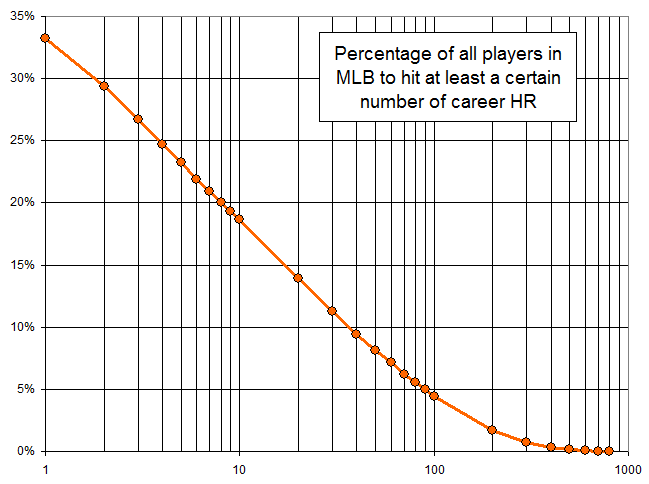
Here’s a relatively simple plot showing the percentage of all 18,690 MLB players in history to hit “X” home runs. In other words, about 33% of all players hit at least 1 homer, about 29% hit at least 2 homers, etc. Some other key numbers: 19% hit at least 10, 4.4% hit at least 100, and 0.16% have hit at least 500.

It’s unsurprising that the curve is linear for the middle section–with around 3,000 players to hit 10+ homers, we see a smooth and expected distribution with so many data points. I assume the lower end of the curve at 1 and 2 homers falls off because there is an unusually high number of players to hit very few homers. This includes lots of pitchers and other players who had only a cup of coffee and managed only a dinger or two. The high end of the curve fails to fall off linearly I assume because players who hit a fair number of homers tend to be the ones who are selected to stick around in MLB and therefore hit even more. The hitting of homers isn’t simply a random event distributed over the entire population–certain players are selected to remain in MLB, and the longer a guy sticks around, the more likely it is that he hits homers at an above-average pace.
