We are now in the tenth decade of the live-ball era, generally acknowledged to have begun in 1920. Offensive and defensive periods have come and gone within this era, even to extremes like the 1960s, sometimes referred to as the second dead-ball era, and the homer-happy 1990s and 2000s.
With those changes, the use of starting pitchers has also changed. This post will explore those changes and look at the pitchers who have most frequently exceeded and most frequently fallen short of the changing performance standards expected of starting pitchers.
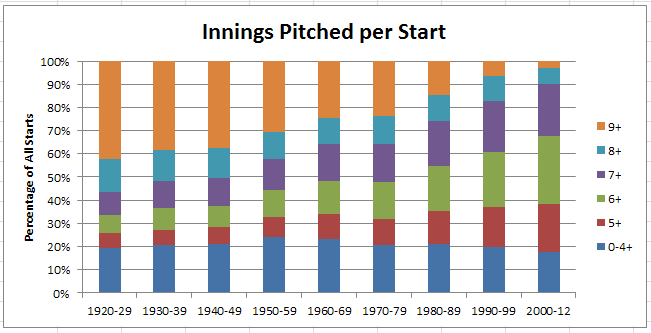
First, let’s look at length of start. At the beginning of the live-ball era, starters were expected to also be finishers or, at the least, pitch late into games. That expectation has changed to the point where pitching 8+ innings has happened in only 10% of starts since 2000, compared to more than 50% of starts prior to 1950.
Here’s a chart showing change in the length of starts.
Thus, the median length of start has grown consistently shorter, as shown in the table below.
| Table 1: Cumulative Percentage of Starts by Innings Pitched per Start | ||||||
| Decade | 0-4+ | 5+ | 6+ | 7+ | 8+ | 9+ |
| 1920-29 | 19.5% | 25.7% | 33.4% | 43.6% | 57.9% | 100% |
| 1930-39 | 20.5% | 27.2% | 36.6% | 48.3% | 61.7% | 100% |
| 1940-49 | 21.1% | 28.2% | 37.6% | 49.4% | 62.6% | 100% |
| 1950-59 | 24.3% | 32.8% | 44.2% | 57.7% | 69.4% | 100% |
| 1960-69 | 23.4% | 34.0% | 48.1% | 64.4% | 75.4% | 100% |
| 1970-79 | 20.9% | 32.0% | 47.9% | 64.1% | 76.2% | 100% |
| 1980-89 | 20.9% | 35.3% | 54.5% | 74.0% | 85.5% | 100% |
| 1990-99 | 19.8% | 37.3% | 60.8% | 82.6% | 93.4% | 100% |
| 2000-12 | 17.5% | 38.4% | 67.7% | 90.0% | 97.1% | 100% |
The level of performance delivered by pitchers has also changed over time, as measured by Game Score. This metric is influenced by how long the pitcher pitches, how hard the pitcher is hit, and also by a pitcher’s strikeouts and walks. A higher game score indicates a game where a starting pitcher has pitched longer and better than in other games with inferior game scores.
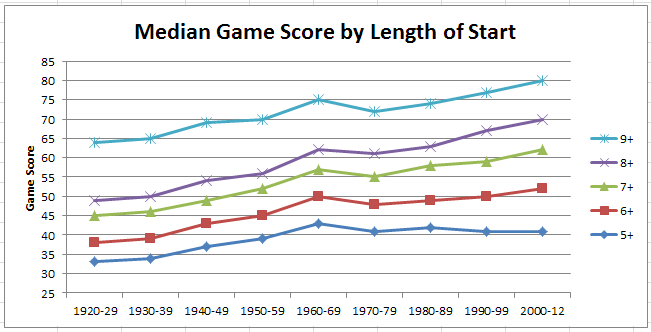
The table below shows median game scores for each decade and length of start. The trend to (mostly) increasing game scores over time is a product of higher strikeout rates, but also of where starts of a certain length fall on the continuum of all starts in a particular decade. For the example cited earlier of starts of 8+ innings, over 35% of starts were longer (CGs or extra innings) prior to 1950, but less than 3% have been longer since 2000; thus, the game score for the post-2000 starts would be expected to be higher inasmuch as they more clearly represent the “cream” of the game starts of that period.
| Table 2: Median Game Score by Length of Start | |||||
| Decade | 5+ | 6+ | 7+ | 8+ | 9+ |
| 1920-29 | 33 | 38 | 45 | 49 | 64 |
| 1930-39 | 34 | 39 | 46 | 50 | 65 |
| 1940-49 | 37 | 43 | 49 | 54 | 69 |
| 1950-59 | 39 | 45 | 52 | 56 | 70 |
| 1960-69 | 43 | 50 | 57 | 62 | 75 |
| 1970-79 | 41 | 48 | 55 | 61 | 72 |
| 1980-89 | 42 | 49 | 58 | 63 | 74 |
| 1990-99 | 41 | 50 | 59 | 67 | 77 |
| 2000-12 | 41 | 52 | 62 | 70 | 80 |
The above table is represented graphically below.
Putting together Table 1 and Table 2 gives us an approximate estimate of average performance level by starters in each decade, in terms of both innings pitched (quantity) and game score (quality). As an example, consider the 1950s. From Table 1, we see that the median start length was at 7+ innings and the corresponding median game score from Table 2 is 52. Thus, starts of 7+ innings with a game score of 52 can be a proxy for average starter performance in the 1950s.
Following from the above example, I looked at the pitchers who most often turned in starts above and below median performance levels for both innings pitched and game score. These pitchers are identified in the following tables, showing the top 15 and ties in number of games, sorted by % of starts represented by those games.
First, the pitchers most often having games at or above the median innings pitched and game score thresholds. Best way to view the tables is to by decade, by typing the first year of the decade (ends in zero, e.g. 1950) in the Search box.
[table id=80 /]
And, the pitchers most often below the median innings pitched and game score thresholds. Note that this does NOT mean the “worst” pitchers. Indeed, some pitchers appear both in this table and the preceding one. Perhaps you could say these are the pitchers good enough to get the ball on a regular basis and for an extended period, but who also may cause the most anxiety for their managers when they’re on the mound.
[table id=79 /]
Lastly, the title question. I pose this question because Barry Zito appears in the top 4 of both above tables for the 2000 to 2012 period. Most often above median, and also most often below that level. In this case, I suspect we’re looking mainly at two half-decades, or perhaps the tale of of San Francisco Bay. East side Barry (2000-2006) has 125 ERA+, but west side Barry (2007-2012) is at just 91 ERA+.


