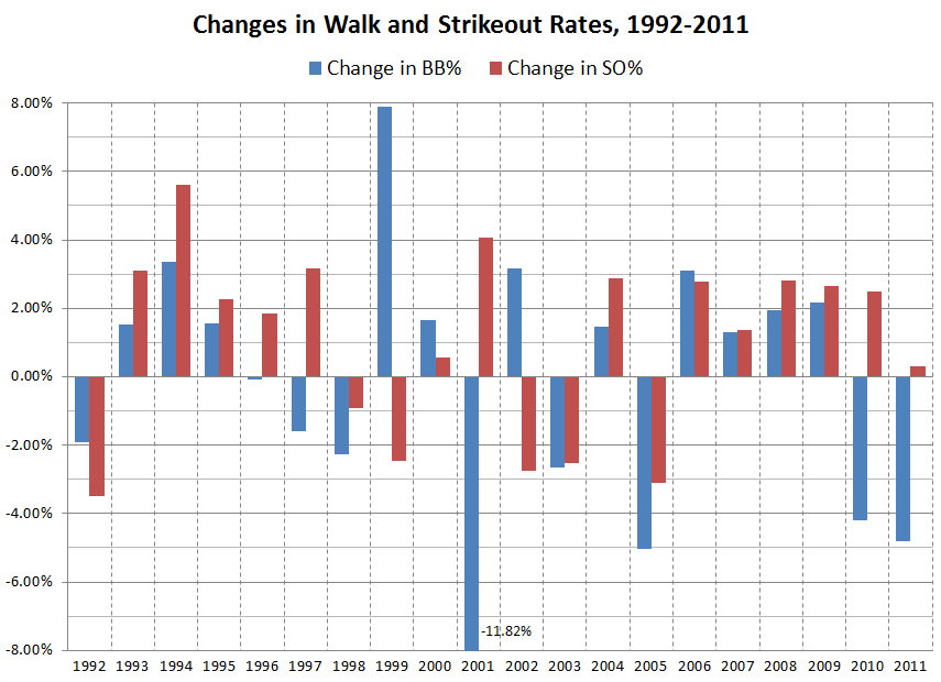
As shown in the graph below, over the past 20 years, walk and strikeout rates (as a percentage of plate appearances) have usually gone in the same direction from year to year, and have usually been within 5 percentage points of each other. A couple of notable exceptions:
- In 1999, the year after McGwire and Sosa shattered the season HR record, the BB rate surged by almost 8%.
- In 2001, MLB directed umpires to enforce the real strike zone instead of their own creative interpretations. The result was drop of almost 12% in walk rate — the largest one-year drop of the past 40 years (at least). This might be considered a reaction to the 1999 spike in BB%, which was consolidated in 2000.
- In 2002, some of the extreme changes from 2001 were reversed. At first blush, this seems like regression toward the mean, or what Bill James called the “Plexiglass Principle.”
For every year from 2003-09, BB% (blue) and SO% (red) went hand-in-hand, whether up or down. For 2006-09, both rates rose about 2% per year.
But in 2010, walks fell by over 4%, while Ks continued their inexorable climb. And last season’s walk rate fell another 4.8%, while Ks rose just a tad. The 2011 walk rate, 8.10% of PAs, was the lowest since 1968, while the 20.8% SO rate was the highest ever.
The last two years are the first time in modern history that the walk rate fell at least 4% in consecutive years. The only other consecutive drops of over 3% was 1951-52, which followed a historic high in walk rates from 1948-50.
Theories on the 2010-11 trend?

