Note: I’ve added a 4th graph at the end of the post, covering only the years 1982-2011.
A couple of graphs relating bWAR/age, and OPS+/age. I’ll leave the observations to you folks.
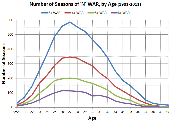
(1) As a general followup to the graphs in my Ryan Zimmerman post, here’s a graph showing the number of seasons of four different WAR levels, for all position players, for the years 1901-2011:
(2) I thought it might be interesting to look at the career patterns of those with the longest careers. The next two graphs cover the top 200 players in Plate Appearances, for the years 1901-2011; they all had at least 8,225 PAs. First, bWAR:
(3) … and then, OPS+:
(4) This last graph covers only the years 1982-2011 and the top 200 players in PAs during that time. This angle grew out of comments by kzuke, who noticed a local peak at age 31 in the original graphs (and here it is again!), and Mike L., who described a pattern of difference between WAR-Avg. and WAR/700 PAs.
I originally thought to cover just the last 20 years — the you-know-what era — but realized I’d have to take in another decade to allow for the full aging process. Even so, I limited the ages to 22-37, since the years before and after would contain less than half the original 200 players. The fewest players covered by any age in this graph is 116 for age 27 and 126 for age 22.
This graph mixes two WAR lines (red and blue, pegged to the Y-axis on the left) and one OPS+ line (green, pegged to the Y-axis on the right). I included some data labels on the OPS+ line to emphasize the distinction. Lastly, note that all WAR averages in these graphs are based only on those who actually played at the given age.


